
A benchmark gives an engineering metric a reference point. The useful part begins when a team can see where it sits, understand what shaped that position and choose one change worth testing.
DevStats puts that comparison into a team benchmark report that is free forever and requires no credit card. The report shows your team percentile and compares it with similar engineering teams, then organizes the findings across DORA benchmarks as well as Flow and Planning metrics.
This article explains how to read that result and turn it into a practical next step. If you want the full foundation, read our guide to engineering benchmark categories, performance ranges and measurement frameworks. This article starts where that one leaves off, with a benchmark report in front of you and a decision to make.
What the benchmark number actually means
A metric is the value your team measured. A benchmark is the external reference used to interpret it. If your PR Cycle Time is 80 hours, the metric describes the elapsed time. Its benchmark tells you how that result compares with a reference group.
A percentile describes position inside a distribution rather than a score out of 100. A hypothetical result at the 72nd percentile means the team sits above 72 percent of the comparison group under that benchmark’s direction of performance. It does not mean the team completed 72 percent of a goal.
That distinction matters because a percentile compresses many observations into one position. It is excellent for spotting a gap or strength quickly, while the metric definition and operating context explain what the team should examine next.
See your own position with the DevStats report
Creating the free report starts with an account and a connection to GitHub or GitLab, with Bitbucket also supported. An issue tracker such as Jira or Linear can be connected when the team wants the corresponding Planning data included, and DevStats builds the report automatically from those sources.
The report is designed to be read from broad context to specific metrics. The team percentile gives you the first orientation, the peer comparison shows how similar engineering teams perform and the metric groups direct attention toward a part of the delivery system. DORA benchmarks include signals such as Deployment Frequency and Change Failure Rate, while Flow and Planning cover measures such as PR Cycle Time and Planning Accuracy.
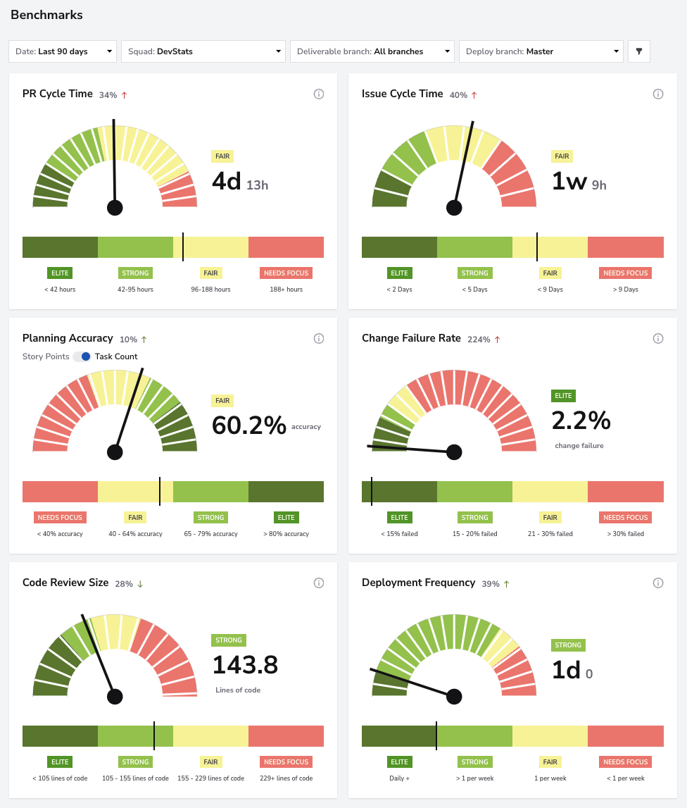
The DevStats benchmark report places each metric within a performance range so the team can see where to investigate first.
The benchmark report remains free and does not expire. The paid platform adds the deeper analysis used for ongoing diagnosis, including drill-downs and trends alongside squad views and AI insights. You can review the offer on the DevStats pricing page or select Get my free benchmark to create the report.
Four choices shape every useful comparison
The metric name on a dashboard is only the label. Four choices determine what the reported position means, and checking them keeps the benchmark connected to the decision the team is trying to make.
- Metric definition. Confirm which event starts the measurement and which one ends it. PR Cycle Time may begin when a pull request opens or when it becomes ready for review, and those definitions produce different values even when the card has the same name.
- Unit of analysis. Establish whether the result describes one service, a product group or the company as a whole. DORA recommends measuring delivery performance at the application or service level so the result reflects a system operating under a coherent set of conditions. DORA’s software delivery performance metrics
- Time window. Choose a period that fits the question. A normal quarter describes the regular delivery system, while an incident week or major launch may be exactly the right window when the team wants to study that event.
- Comparison group. Read the result in relation to the teams behind the reference. Product type and architecture matter, as do operating constraints and the responsibilities carried by each team.
The presentation format changes the reading too. Medians and percentiles locate a result inside a distribution, while ranges and tiers group results into named bands. Before acting, the team should know which format it is looking at and whether higher or lower values indicate better performance for that metric.
These checks keep the process direct and make the next question more precise. DORA’s guidance on measurement frameworks follows the same principle by tying measures to organizational goals and combining system data with the experience of the people doing the work. Choosing measurement frameworks to fit your organizational goals
A slower PR cycle tells you where to look next
Consider a team whose PR Cycle Time is slower than its external benchmark and its recent internal baseline. The comparison shows that changes spend more time between the opening of a pull request and merge, which gives the team a concrete place to start.
The same result can emerge from different parts of the flow. Reviewers may take a long time to pick up a pull request, changes may be too large for a quick review or dependencies may keep approved work waiting. The benchmark identifies the gap, while stage-level measures and the team’s knowledge locate the source.
Suppose the data shows that most elapsed time sits before the first review. The team can test clearer reviewer ownership or smaller change boundaries, then compare the next period with its baseline. Our article on how Flow metrics help diagnose delivery outcomes explains this relationship in more detail.
Speed still needs a companion measure. Reading PR Cycle Time beside Change Failure Rate keeps stability visible while the team shortens review time. The benchmark supplies direction, the diagnostic metric narrows the work and the guardrail shows whether the change improved the system as intended.
Turn the percentile into one test
A benchmark becomes useful through a short learning cycle. A single percentile is enough to define a specific test and learn from the result before widening the change.
- State the observed gap and confirm its definition, scope and time window.
- Compare the external position with the team’s own baseline to see whether the same system has been improving or moving in another direction.
- Use a more detailed metric and the team’s operating knowledge to find where the result is produced.
- Test one change, keep a quality or stability guardrail visible and measure the same system again.
This sequence separates three jobs that are often mixed together. The benchmark shows where the team stands, the diagnostic work explains where to intervene and the baseline confirms what changed after the intervention. Each part answers a different question.
The score gives the team a concrete next step
Software engineering benchmarks work best when they shorten the distance between a broad concern and a testable decision. Instead of debating whether delivery merely feels slow, the team can identify the metric that differs from its reference, locate the relevant part of the flow and agree on the evidence that would confirm an improvement.
DevStats gives you that starting point with your own engineering data. Select Get my free benchmark to see your team percentile, peer comparison and metric-level benchmarks. The report is free forever and requires no credit card.